Teaming up with a group of other student designers, I worked in collaboration to develop a rebrand for the not-for-profit food pantry based in Altoona, WI, Altoona Compassion Coalition. I worked closely with my group to design promotional materials such as poster designs, and logo marks, and to collaboratively establish a brand guide for ACC. My focus was dedicated to social media materials for their Facebook page.
Brand Guide
This is a brand guide that we put together to help create a more uniform and cohesive brand as we worked on all of the various deliverables. Brand guides are used to give a standardized look to a particular organization, as well as their documents. This guide has various typefaces we used, the general color palette we stuck to, as well as the new logo that we used throughout our work. Moving forward without having us as a reference, this document will be really helpful in maintaining a brand that is consistent and is easily identifiable by the community.
Uses of Primary Color Palette:
- Wordmark Logo.
- Title of company.
- Can also be used as background colors for printed or digital media when applicable.
Uses of Secondary Color Palette:
- Can be used as accent colors with certain elements (like imagery).
- Use for background colors on printed or digital media.
Mundial Bold:
- Use for headers in print and web material.
- Use sparingly in contexts where emphasis is needed. (ie., refer to donations needed poster, Mundial Bold is used to emphasize phrases like “Items wanted include” or "Please visit our website at ‘www.altoonacompassioncoalition.com”
Mundial DemiBold:
- Use for subheaders in print and web material.
- Use for headers in print and web material when Mundial Bold appears too heavy.
Mundial Regular:
- Use in wordmark logo for COMPASSION and FOOD PANTRY.
- Use in single lined body copy.
- Use for footers on print including info like Facebook, Address, Email, etc.
Mundial Light:
- Use in single-lined body copy when Mundial Regular appears too heavy and Mundial Thin is too light.
Mundial Thin:
- Use in wordmark logo for ALTOONA
- Use in single-lined body copy when Mundial regular appears too heavy.
Logos
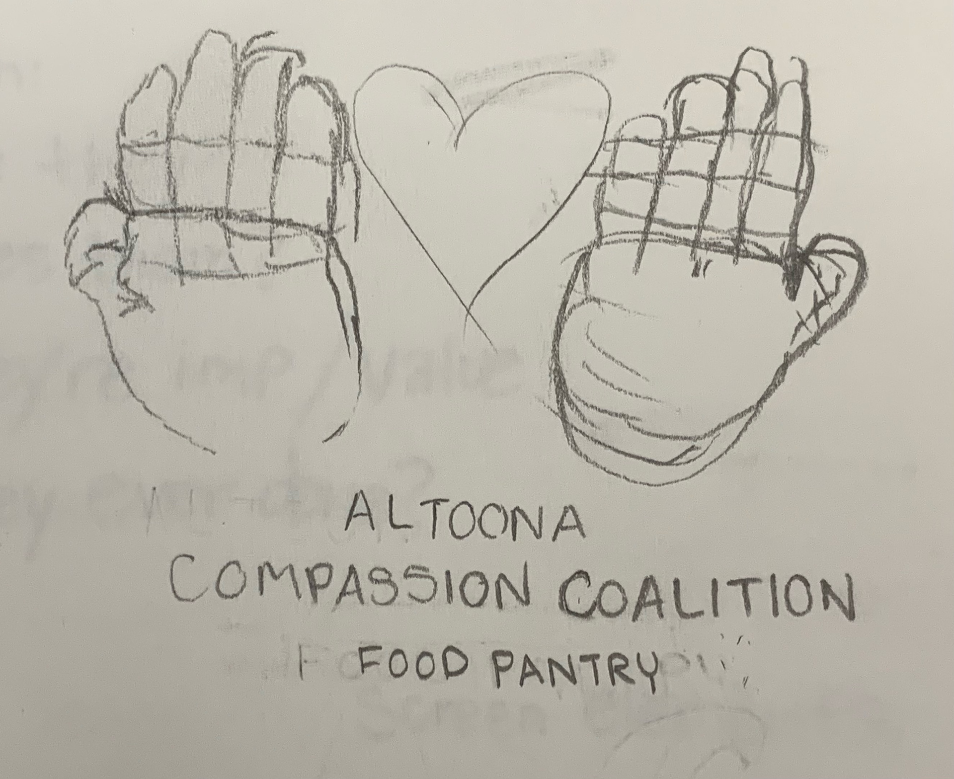
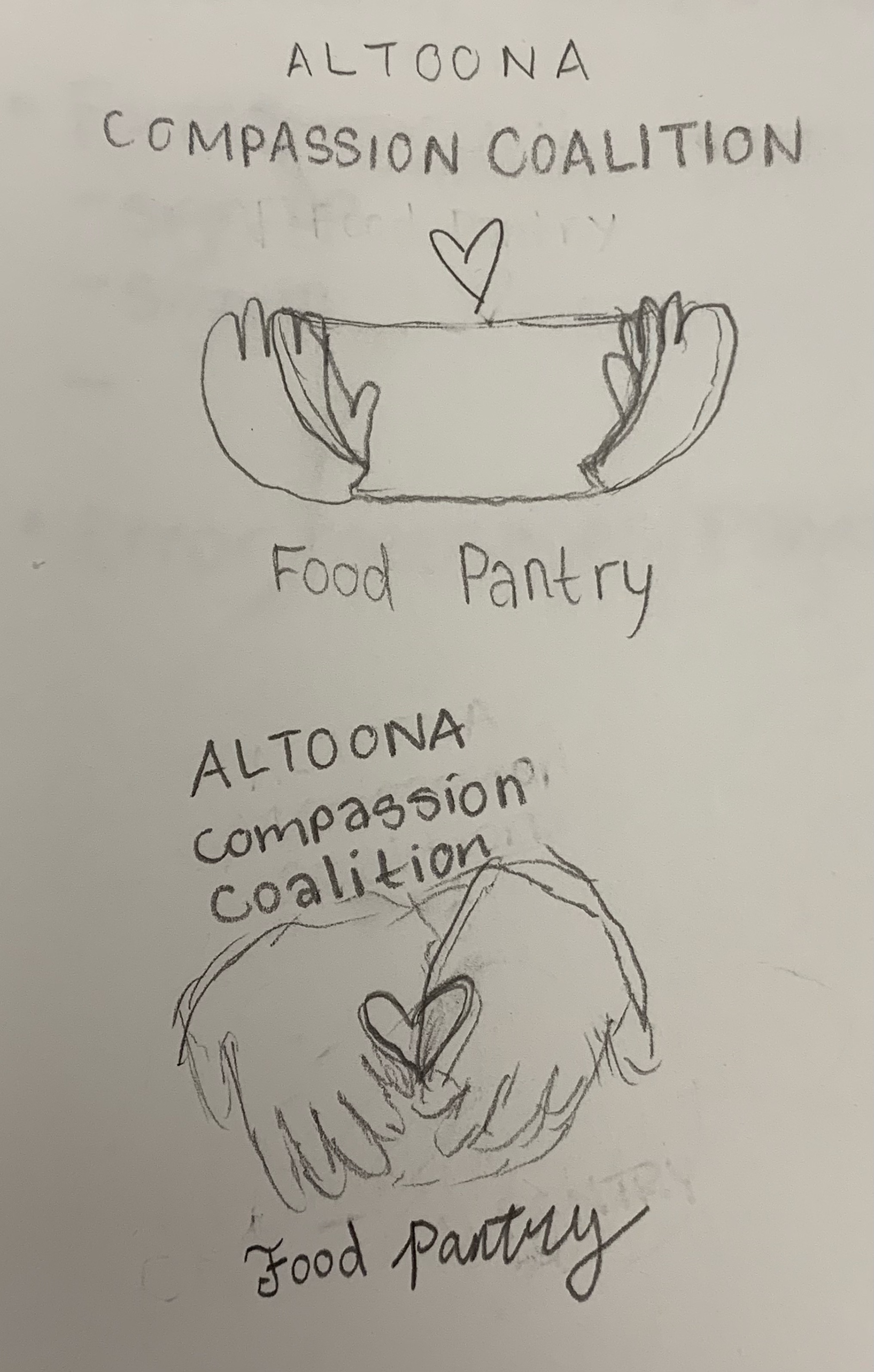
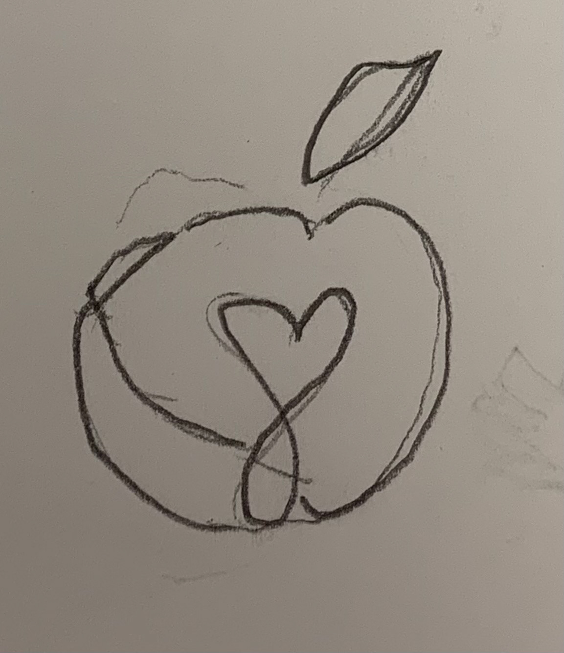
ACC's logo was the first item we collaborated on. This new logo was designed to incorporate all of the ACC’s brand qualities and voice into one. The interlocking hands resembling a heart shape not only show elements of compassion and community, but also demonstrate diversity with the two different colored hands. The two hands and colors together coincide to form an apple, giving way to the mission of the food pantry.
Main Logo:
- Used for all promotional materials both printed and digital.
- Not to be used when background colors are any of the primary color pallet tones or if pictorial mark is more applicable (ie. profile picture for social media, merchandise design, etc.).
Main Logo (black):
- Can be used when color is unavailable for printed materials or as you seem suitable.
Main Logo (red):
- Can be used for both printed and digital media when secondary color pallet or colors #99382f, #c05243, #5b8d79, #231f20, from the primary pallet are used as a background color.
Multi-color heart:
- Can be used for profile picture on social media with any chosen secondary color pallet as background.
Black heart:
- Can be used as icons on social platforms such as facebook or website.
- Can be used as profile picture on social media with any chosen primary colors as background.
Red heart:
- Can be used as icons on social platforms such as facebook or website.
- Can be used as profile picture on social media with #99382f, #c05243, #5b8d79, #231f20 from primary pallet or any chosen secondary pallet color as background.
Creative Process
In pursuit to give this organization's brand a more modernized look, my design team and I started our brainstorming process with group white-boarding and individual sketches.
Social Media (Facebook Page)
